
Angular Super Forms: Password Confirmation
Epic Angular Form Validation Made Easy
Originally published in ITNEXT
Super Forms
Validating user input is a quintessential skill for front-end developers and an important part of delivering a good user-experience. Implementing data entry is one of the most common problems faced by Angular developers. Knowing how to effectively implement form validation is one of the characteristics that defines a heroic developer.
A rock-solid validation strategy consists of strong types, professional-looking error messages, and proper validation rules on both the individual inputs and the interaction between inputs.
In this tutorial we will be using Angular, ng-bootstrap, ngneat/error-tailor, and Reactive Forms to create a Change Password form, configure control validators, configure a form validator, and display inline validation error messages.
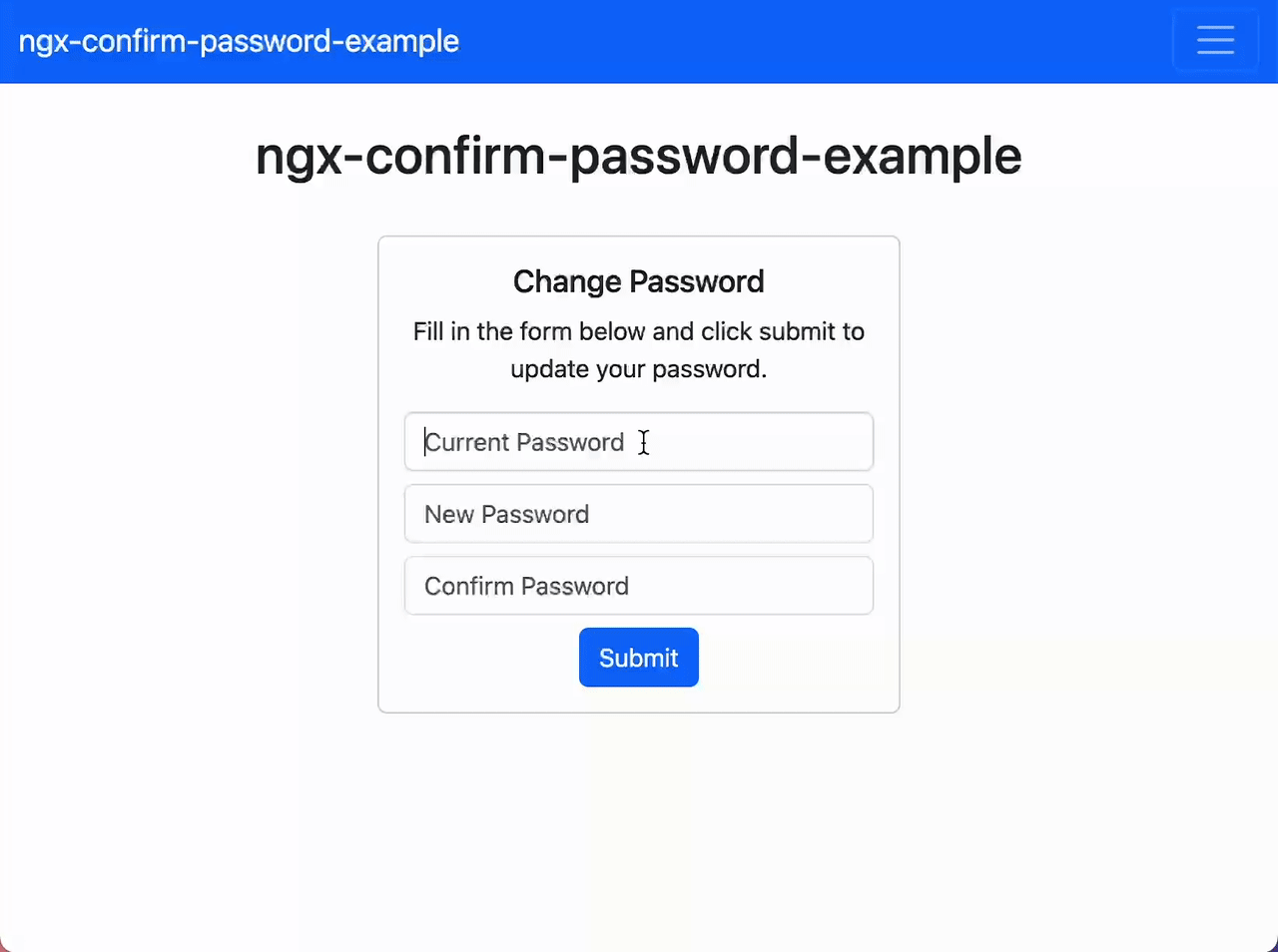
By the end of this article, you should have something that approximates the following.
Origin Story
At BugSplat, we were able to switch our production web app’s authentication provider to Cognito in just over a week — if that’s not heroic I’m not sure what is! Part of our authentication switch included recreating some components that didn’t fit our desired UI/UX.
During our switch to Cognito, one of the components we built was a Change Password form. Our new form contains inputs for the user’s old password, new password, and new password confirmation. We wanted to validate that each form field was required, was a minimum of 8 characters, and that each field contained an uppercase, lowercase, number, and special character. Most importantly, we wanted to validate that the value of the new password input was equal to the value of the confirm password input.
I scoured the internet, but didn’t find a resource that demonstrated how to validate two form controls were set to matching values. After fiddling with the implementation for a few hours, I was able to extract the good stuff to an example that I could reference in this article.
Bootstrap
To get started, let’s install our dependencies. First up is ng-bootstrap, an Angular wrapper around Bootstrap that we’re just using to make our forms look good.
ng add @ng-bootstrap/ng-bootstrapThis command will use Angular schematics to import NgbModule, and will also add an import for the Bootstrap styles in your applications styles.scss file.
Error Tailor
Next, we’ll use Netanel Basal and Shahar Kazaz’s error-tailor package from the ngneat suite of Angular tools. Once configured, the error-tailor package will automatically add messages underneath our form controls when they are touched and invalid.
npm install @ngneat/error-tailorTo configure error-tailor, you’ll need to add the relevant providers and imports. If you’re using standalone components, add a call to provideErrorTailorConfig to the providers array of bootstrapApplication call in main.ts.
import { provideErrorTailorConfig } from '@ngneat/error-tailor';

bootstrapApplication(AppComponent, {
  providers: [
    provideErrorTailorConfig({
      // We'll fill this out later
    })
  ]
})
Add the errorTailorImports and ReactiveFormsModule to every component that contains a form that you intend to use with error-tailor.
import { ReactiveFormsModule } from '@angular/forms';
import { errorTailorImports } from '@ngneat/error-tailor';

@Component({
  selector: 'app-root',
  standalone: true,
  imports: [errorTailorImports, ReactiveFormsModule]
})
export class AppComponent {
  // AppComponent implementation goes here
}
Alternatively, if you’re using NgModules you’ll need to add provideErrorTailorConfig to the providers array in app.module.ts instead. Similarly, you’ll need to add errorTailorImports and ReactiveFormsModule to your module’s imports array.
import { NgModule } from '@angular/core';
import { ReactiveFormsModule } from '@angular/forms';
import { BrowserModule } from '@angular/platform-browser';
import { NgbModule } from '@ng-bootstrap/ng-bootstrap';
import { AppComponent } from './app.component';
import { errorTailorImports, provideErrorTailorConfig } from '@ngneat/error-tailor';

@NgModule({
  declarations: [
    AppComponent
  ],
  imports: [
    BrowserModule,
    errorTailorImports,
    NgbModule,
    ReactiveFormsModule
  ],
  providers: [
    provideErrorTailorConfig({
      // We'll fill this out later
    })
  ],
  bootstrap: [AppComponent]
})
export class AppModule { }
Great! Now that you’ve configured the dependencies you should be ready to start creating forms like a Working Dev’s Hero.
Component Validation
In your app.component.ts file, let’s scaffold a new reactive form.
import { Component } from '@angular/core';
import { FormGroup, NonNullableFormBuilder, Validators } from '@angular/forms';
import { ChangePasswordFormGroup, ControlsOf } from './change-password-form-group';

const upperLowerSymbolNumberRegex = /(?=.*\d)(?=.*[a-z])(?=.*[A-Z])(?=.*\W)/;

@Component({
  selector: 'app-root',
  templateUrl: './app.component.html',
  styleUrls: ['./app.component.scss']
})
export class AppComponent {
  formGroup: FormGroup<ControlsOf<ChangePasswordFormGroup>>;

  constructor(formBuilder: NonNullableFormBuilder) {
    const validators = [Validators.required, Validators.minLength(8), Validators.pattern(upperLowerSymbolNumberRegex)];

    const currentPassword = formBuilder.control('', validators);
    const newPassword = formBuilder.control('', validators);
    const confirmPassword = formBuilder.control('', validators);

    this.formGroup = formBuilder.group<ControlsOf<ChangePasswordFormGroup>>(
      {
        currentPassword,
        newPassword,
        confirmPassword,
      },
    );
  }

  onSubmit() {
    console.log(this.formGroup.value);
  }
}
Let’s also define the ChangePasswordFormGroup interface for our form.
export interface ChangePasswordFormGroup {
  currentPassword: string;
  newPassword: string;
  confirmPassword: string;
}
And finally, define a ControlsOf utility type to help us create a form group that is strongly typed.
export type ControlsOf<T extends Record<string, any>> = {
  [K in keyof T]: T[K] extends Record<any, any>
    ? FormGroup<ControlsOf<T[K]>>
    : FormControl<T[K]>;
};
There are a few things that are worth mentioning in the snippets above.
The first thing to notice is ControlsOf<ChangePasswordFormGroup>. The ControlsOf utility type allows us to convert an interface’s string types to FormControl<string> types. This allows us to define the data model with a single interface and ensure that our form adheres to the same interface.
Here’s what ControlsOf<ChangePasswordFormGroup> evaluates to:
interface ControlsOf<ChangePasswordFormGroup> {
  currentPassword: FormControl<string>;
  newPassword: FormControl<string>;
  confirmPassword: FormControl<string>;
}
More info on the ControlsOf utility type can be found here.
The next piece worth noting is that we’re injecting NonNullableFormBuilder into the constructor. We use the NonNullableFormBuilder because otherwise, we get compiler errors that FormControl<string | null> cannot be assigned to an object expecting the type FormControl<string>.
constructor(formBuilder: NonNullableFormBuilder) { ... }Angular University has a really good article on strongly-typed Angular forms and discusses the NonNullableFormBuilder service as well.
Finally, we’ve also created an array of validators that we’re passing to each of the form controls.
const validators = [Validators.required, Validators.minLength(8), Validators.pattern(upperLowerSymbolNumberRegex)];

const currentPassword = formBuilder.control('', validators);
const newPassword = formBuilder.control('', validators);
const confirmPassword = formBuilder.control('', validators);
Notice that we’re using Validators.pattern(upperLowerSymbolNumberRegex). This regular expression was found on Stack Overflow, and we created a const with a descriptive name so that the next developer to work on the code can more easily understand the purpose of the complicated regular expression.
Now that we’ve scaffolded the reactive form, add the following snippet to your app.component.html file.
<div class="container">
  <div class="row justify-content-center">
    <div class="col-12 col-md-6 col-lg-3 text-center">
      <div class="card">
        <div class="card-body">
          <h5 class="card-title">Change Password</h5>
          <p class="card-text">Fill in the form below and click submit to update your password.</p>
          <form class="form-group" [formGroup]="formGroup" (ngSubmit)="onSubmit()" errorTailor>
            <input class="form-control" formControlName="currentPassword" placeholder="Current Password" type="password" >
            <input class="form-control mt-2" formControlName="newPassword" placeholder="New Password" type="password">
            <input class="form-control mt-2" formControlName="confirmPassword" placeholder="Confirm Password" type="password">
            <button class="btn btn-primary mt-2" type="submit">Submit</button>
          </form>
        </div>
      </div>
    </div>
  </div>
</div>
Notice that on the very end of the <form> tag we’ve added the errorTailor directive. The errorTailor directive makes validation messages magically appear when a form control has been changed and unfocused.
We can double back and define the messages that are displayed when there’s a form validation error by modifying the config parameter that’s passed to provideErrorTailorConfig.
@NgModule({
  declarations: [
    AppComponent
  ],
  imports: [
    BrowserModule,
    errorTailorImports,
    NgbModule,
    ReactiveFormsModule
  ],
  providers: [
    provideErrorTailorConfig({
      errors: {
        useValue: {
          required: 'This field is required',
          minlength: ({ requiredLength }) => `Field must be ${requiredLength} characters`,
          pattern: 'Field must one uppercase, one lowercase, one number, and one special character',
        }
      }
    })
  ],
  bootstrap: [AppComponent]
})
Styles
By default, error-tailor adds a label element below invalid form controls that can be styled by defining the .control-error class in styles.scss.
.control-error {
    width: 100%;
    margin-top: 0.25rem;
    font-size: 12px;
    color: #dc3545;
}
The name of the class used by error-tailor can be changed via the ControlErrorsClass property. A custom class can also be added to the invalid form control element via the ControlCustomClass property.
More info on how to use error-tailor to style invalid inputs can be found here.
Form Validation
To test your form validation, start your app, select an input, and start typing.
You should be able to generate error messages by typing invalid text into an input and clicking away from it or tabbing to the next field.
You might have noticed that there’s nothing preventing you from entering different passwords in the newPassword and confirmPassword fields.
We can add validation to the form group that ensures our newPassword and confirmPassword fields are equivalent by passing an object with a validators property in the call to formBuilder.group(…).
import { createEqualsValidator } from './equals-validator';

// Omitted a bunch of stuff here

this.formGroup = formBuilder.group<ControlsOf<ChangePasswordFormGroup>>(
  {
    currentPassword,
    newPassword,
    confirmPassword,
  },
  {
    validators: createEqualsValidator(newPassword, confirmPassword),
  }
);
The call to createEqualsValidator accepts references to the two controls we want to validate are equal and returns a ValidatorFn accordingly.
We use FormControl as the input parameter types instead of string so that the validator is guaranteed to validate controls that actually exist (instead of using control name strings to look up controls that might not exist).
import { FormControl, ValidatorFn } from '@angular/forms';

export const mismatchErrorKey = 'mismatch';

export function createEqualsValidator(control: FormControl, matchControl: FormControl): ValidatorFn {
  return () => (control?.value === matchControl?.value ? null : { [mismatchErrorKey]: true });
}
Also, notice that we exported const mismatchErrorKey and returned an ValidatorErrors object that used the const key as a property indexer. Using a variable as an object’s key is also called using computed property names.
In this case, using a computed property name is nice because we can’t guarantee the types of Angular’s ValidationErrors. We can, however, define the error key as a reference to a const that can be copied and pasted. By using a const we can give other developers a bit of safety when accessing the matching property by ensuring its key is defined in one location (as opposed to littering magic strings throughout the code base).
We can also use the computed property name to define the error message in the call to provideErrorTailorConfig.
import { mismatchErrorKey } from './change-password-form/equals-validator';

// Omitted a bunch of stuff here

providers: [
  provideErrorTailorConfig({
    errors: {
      useValue: {
        required: 'This field is required',
        minlength: ({ requiredLength }) => `Field must be ${requiredLength} characters`,
        pattern: 'Field must one uppercase, one lowercase, one number, and one special character',
        [mismatchErrorKey]: 'Passwords must match',
      }
    }
  })
],
Now that you’ve added the form validator, update your form with mismatched passwords and click submit. You should see a new “Passwords must match” error message.
Conclusion
In this article, we built a password changer form component. We discussed how to effectively use the ngneat/error-tailor library to display both input and form group error messages. We added our own custom form validator and discussed some heroic strategies to improve the DX for the next person who works on our code.
Thanks for reading!
Want to connect? If you found the information in this tutorial valuable, please follow me on X.